Create an urban illustration with markers
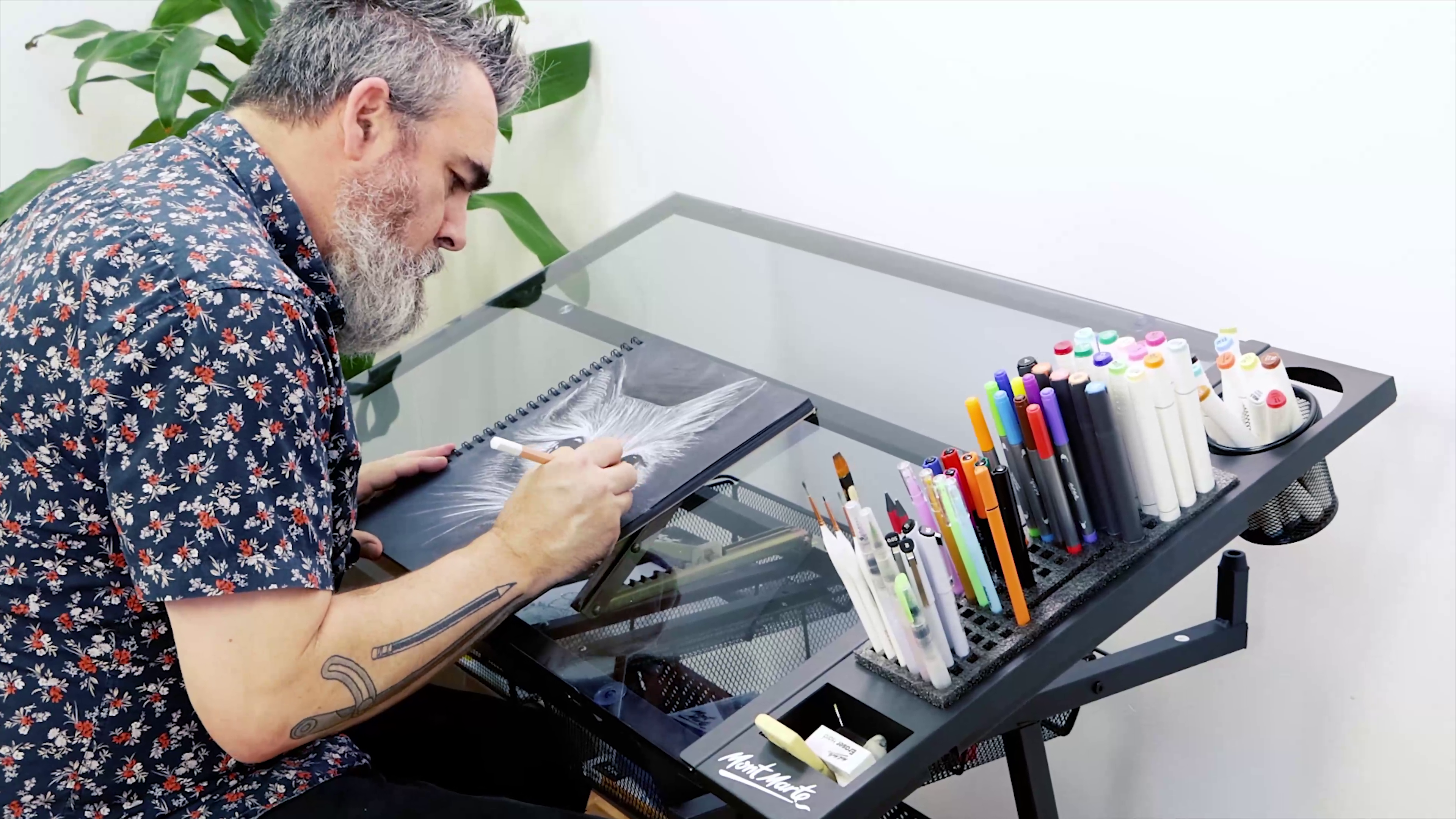
This week Joe teaches us how to create an urban illustration with our Graphic Fineliners and Dual Tip Alcohol Markers. Use bright colours to blend, layer and create new tones! Check out the materials list and lesson below!
1. Creating the outline
Transfer the attached outline onto the sheet of marker paper. To do this we can slip the outline printout under the first sheet. This works well as the outline sheet can be seen through the sheet of marker paper. Alternatively, the sheets can be taped to a light box or up against a window and it will be even easier to see the outline. Use a 0.5 Graphic Fineliner to transfer the line work.
Once the outline has been transferred we can lightly draw in some clouds with a HB pencil.
2. Colouring the sky
Add the blue of the sky with the Sky Blue #76. Use the fine tip and create a series of lines that butt directly up to each other and work across the page in between the clouds. By using this method the colour and the pattern is more consistent. Keep going until the blue is all in.
To give the clouds some shape, apply Warm Grey #WGO.5 into the underside of the clouds with the broad nib. Apply this colour to the foreground area with the broad nib.
3. Colouring the buildings
Lay Pastel Peach #26 into the main building. This will be an under layer and we will be adding more colours over the top.
Continue layering by applying Terracotta #21 into the building in any mid shadow areas. Refer to the colour guide image for reference.
Add Orange #23 into the building between the columns and then blend Cherry Red #12 into this. When an alcohol marker is laid over the top of another layer it will reactivate the underlying area to an extent. This is handy for creating blended colours.
Darken any areas of shadow with Cool Grey #CG65 using the fine nib.
Tip: Alcohol markers are used in a similar way to water colours by beginning from the light tones and moving up to darker ones over the top.
4. Detailing the surrounding buildings
As high rise buildings are made from concrete and glass, use greys and blues to show this. To give the buildings some shape give the front plane and side planes of each building a different tone.
For the high rise on the right of the scene, use Warm Grey #WG0.5 and Pastel Peach #26.
Colour the high rise in the centre with Ocean Blue #71 and Ice Blue #65. Blend these colours together.
Use Pastel Peach #26 and Blue Grey #BG1 to colour the two buildings on the left.
5. Final Details
To create the trees at the front of the main building, add Pale Green #59 to the tree outlines. Use Viridian #54 and then some more Pale Green #59 over the top to blend the colours together so that the tone is broken.
The final stage is to redefine and add more detail with a number 0.3 fine liner onto the drawing where necessary.
Material List
- Dual Tip Art Markers Premium 24pc
- Graphic Fineliners Set Premium 7pc


